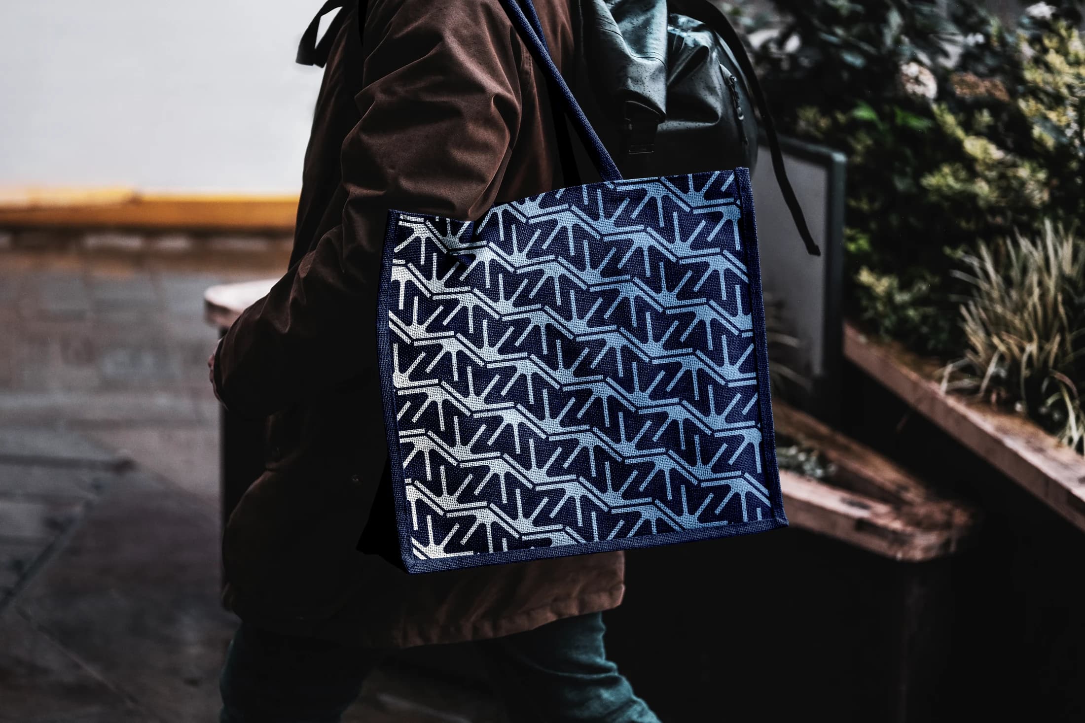
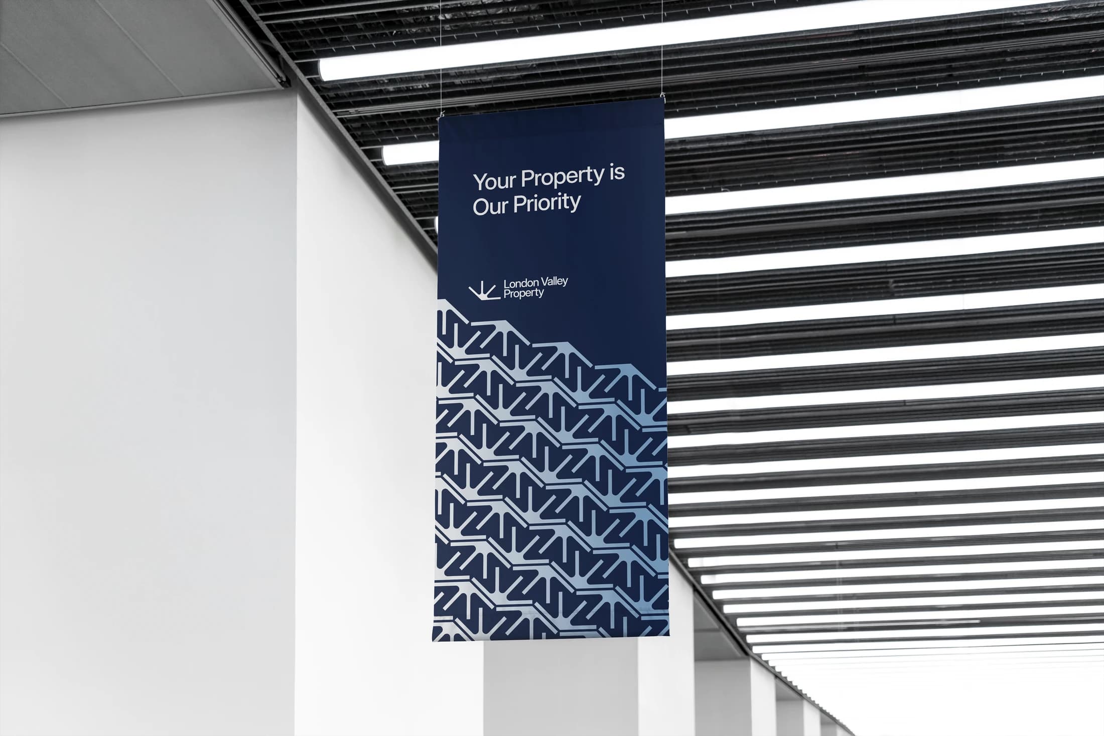
The London Valley identity centres on a compact directional mark that can operate on its own or become a repeating graphic element. A restrained family of blues gives the system a consistent tone across photographic layouts and physical applications.
The selected work tests the identity on a presentation screen, hanging flags, a tote and a mobile icon, using mockups to compare the mark at different scales. The repeated pattern adds a more distinctive surface language while keeping the core emblem visible. This case study focuses on the design system and its application, complementing the separate Ventures entry about the broader commercial role at the business.