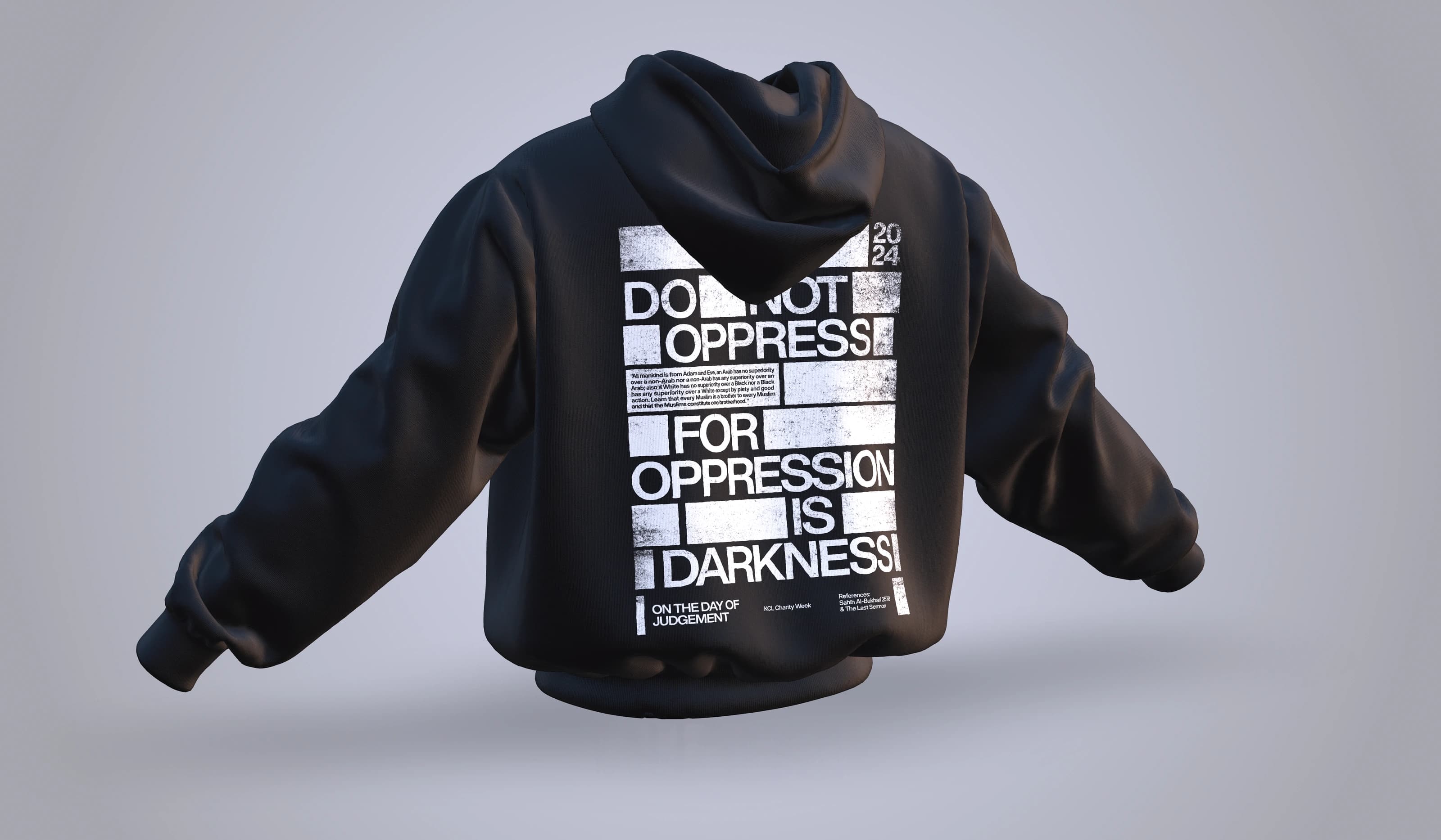
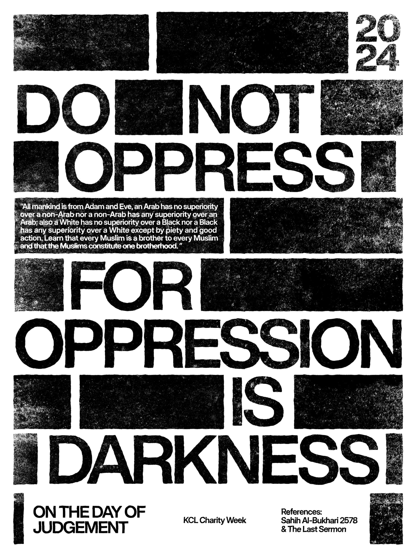
Against Oppression uses typography as the main image. Large uppercase lines create a strong rectangular block, with photographic texture and smaller information breaking the surface without weakening the hierarchy. The restricted black-and-white treatment keeps the emphasis on the statement and allows the work to translate directly into a garment graphic.
The hoodie mockup presents the print on a garment, while the flat artwork shows the relationship between the text, texture and supporting details, with a strong outer shape that can hold its presence as a large garment print. This is a separate Charity Week direction from Acts of Kindness, using a more forceful visual language and a tighter layout to give the message an immediate presence.